Art Director & Designer
karol.jpg

The Karol Hotel


The Karol Hotel

As an homage to her accomplished life, The Karol Hotel embodies the many sides of Miss Karol K, Florida’s first weather woman and a well-known debutante and beauty queen. She is a gracious host, a light in her community, and never shies from indulging in the finer things. To bring this story to life, this brand identity balances touches of inspired pairings and organic discovery over a foundation of timeless, sophisticated design.

View the Website


Logo
Brand Identity

A55I4746.jpg
Rectangular-Pillow-Mockup.jpg


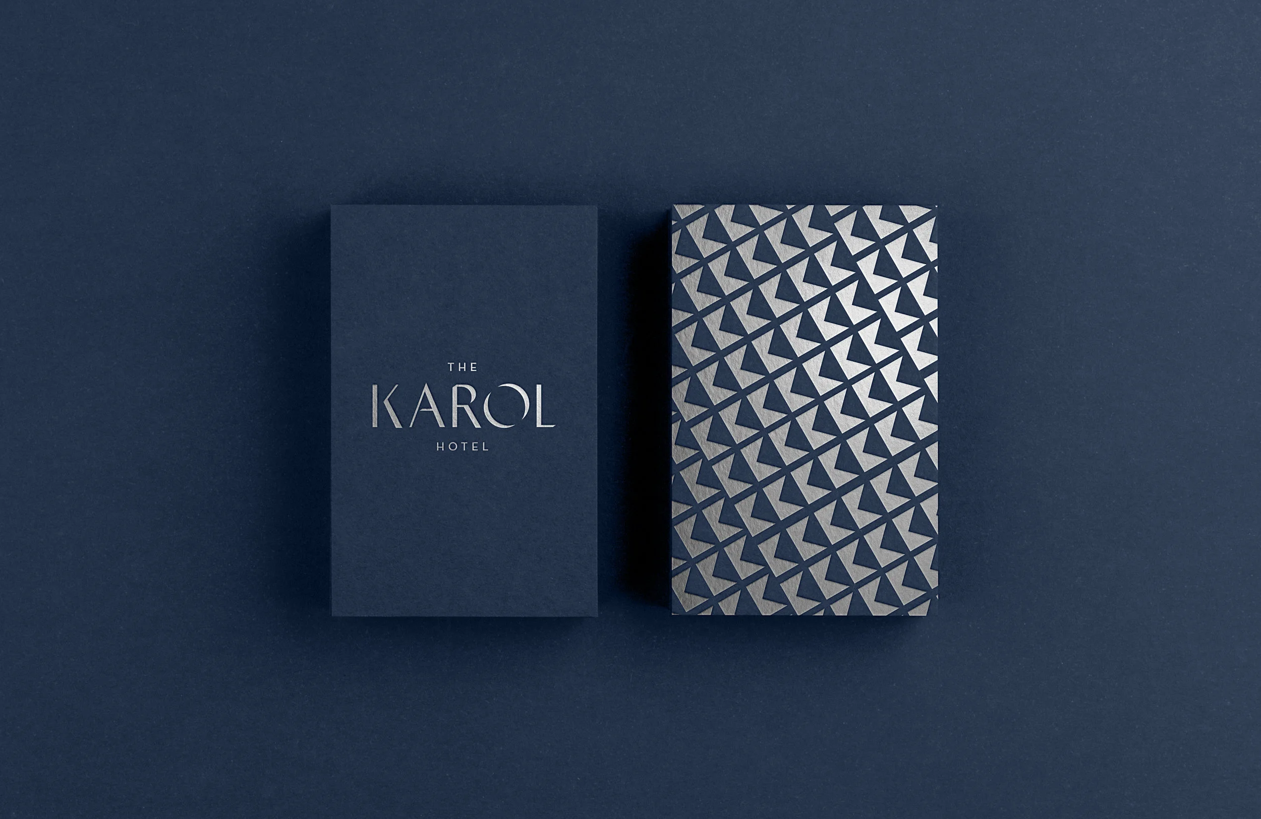
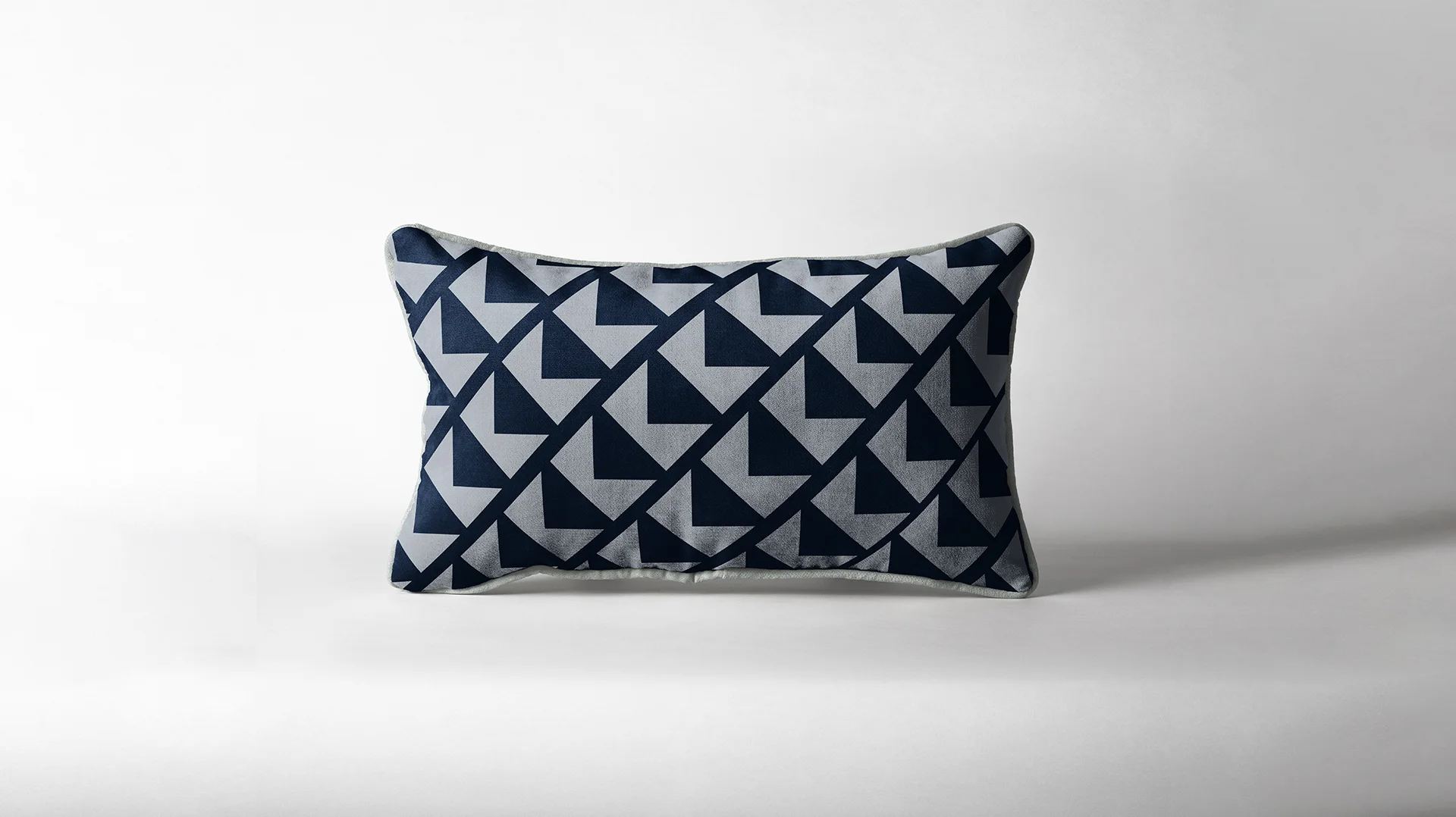
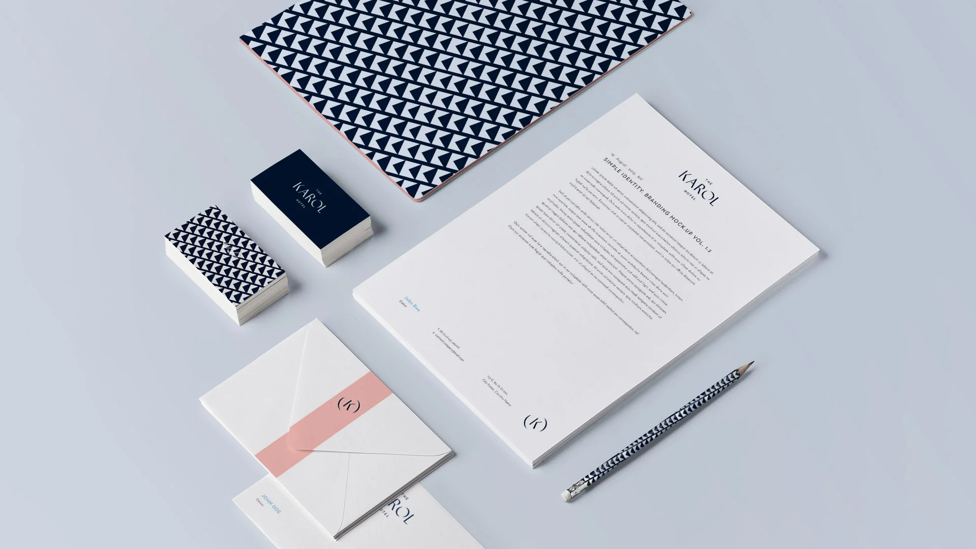
The logotype itself incorporates letterforms with edges that mirror gemstones, a symbol of glamour and reference to Karol K’s sophistication. A minimal, geometric “K” pattern is paired with a bold and elegant color palette reflecting different sides to Karol K’s personality. This pattern is used throughout various textiles and printed materials within the hotel.


Vantage1.jpg
Vantage2.jpg


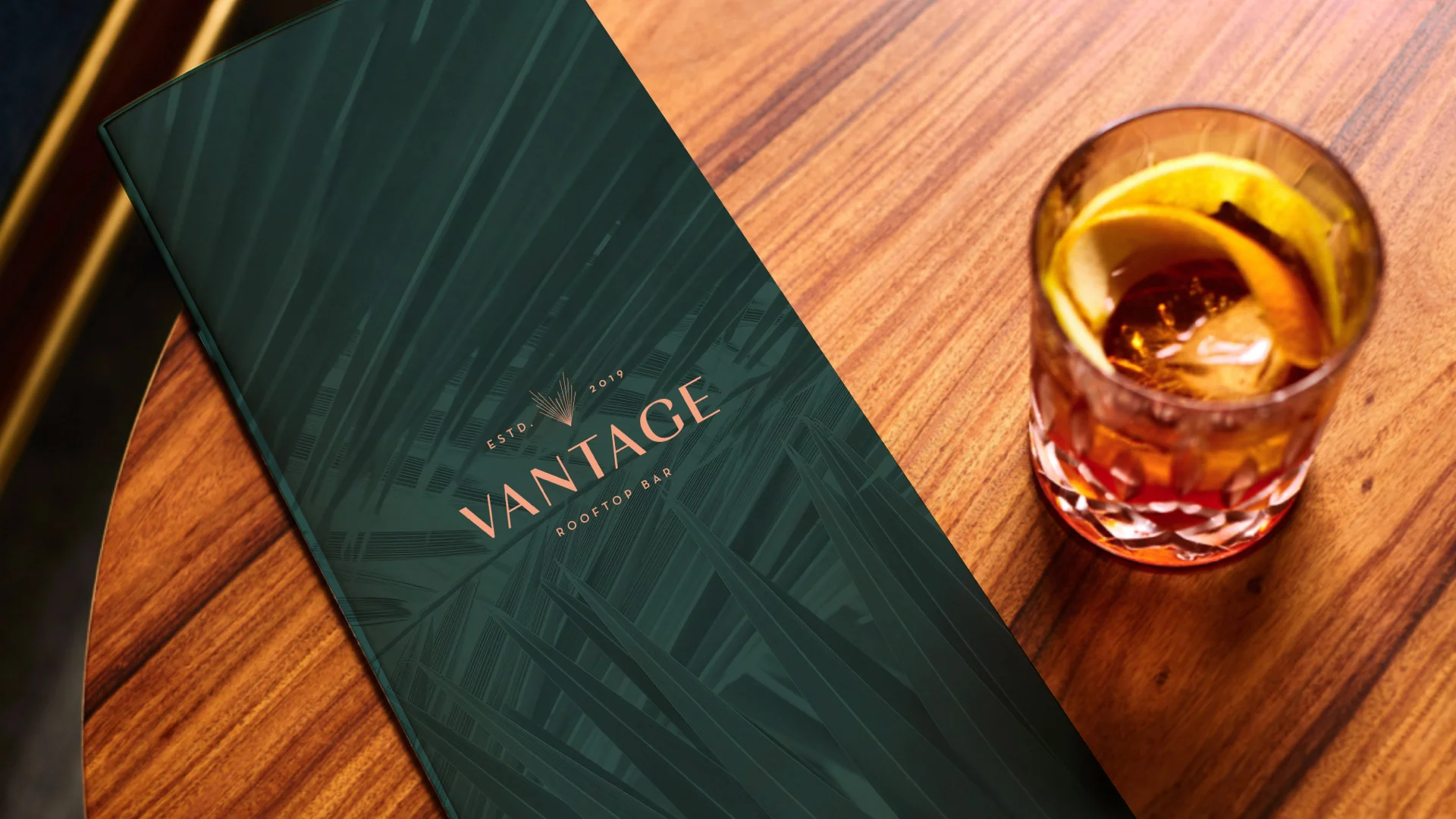
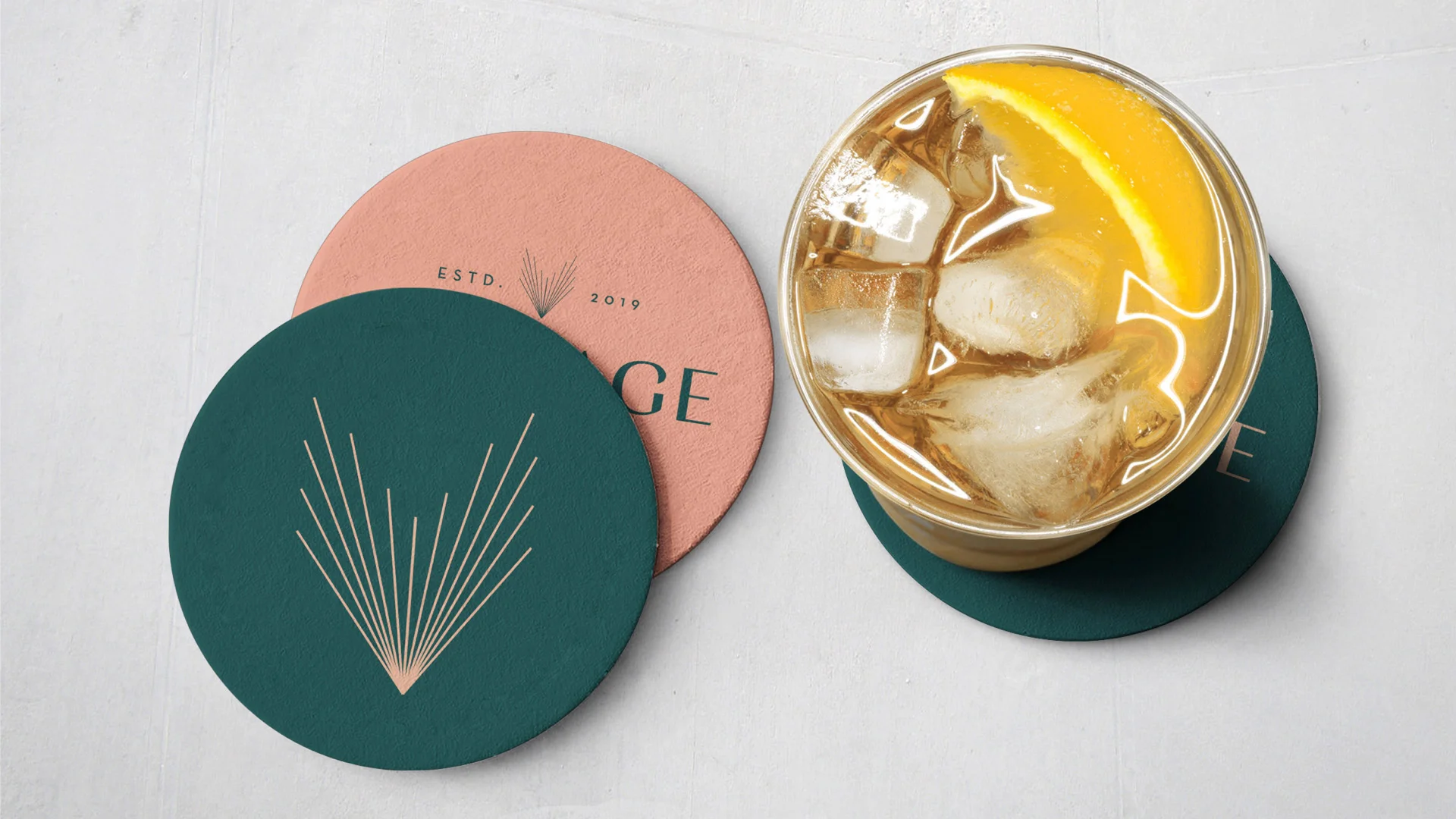
Vantage Rooftop Bar is located at the top of The Karol Hotel, named after its stellar view. This logo was inspired by the idea of bringing the outside in, incorporating a palm-like logomark inspired by Tampa’s natural beauty, as well as a node to the “V” in Vantage.

 
 
Menu1.jpg


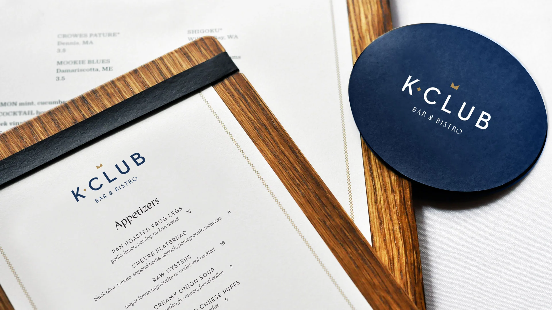
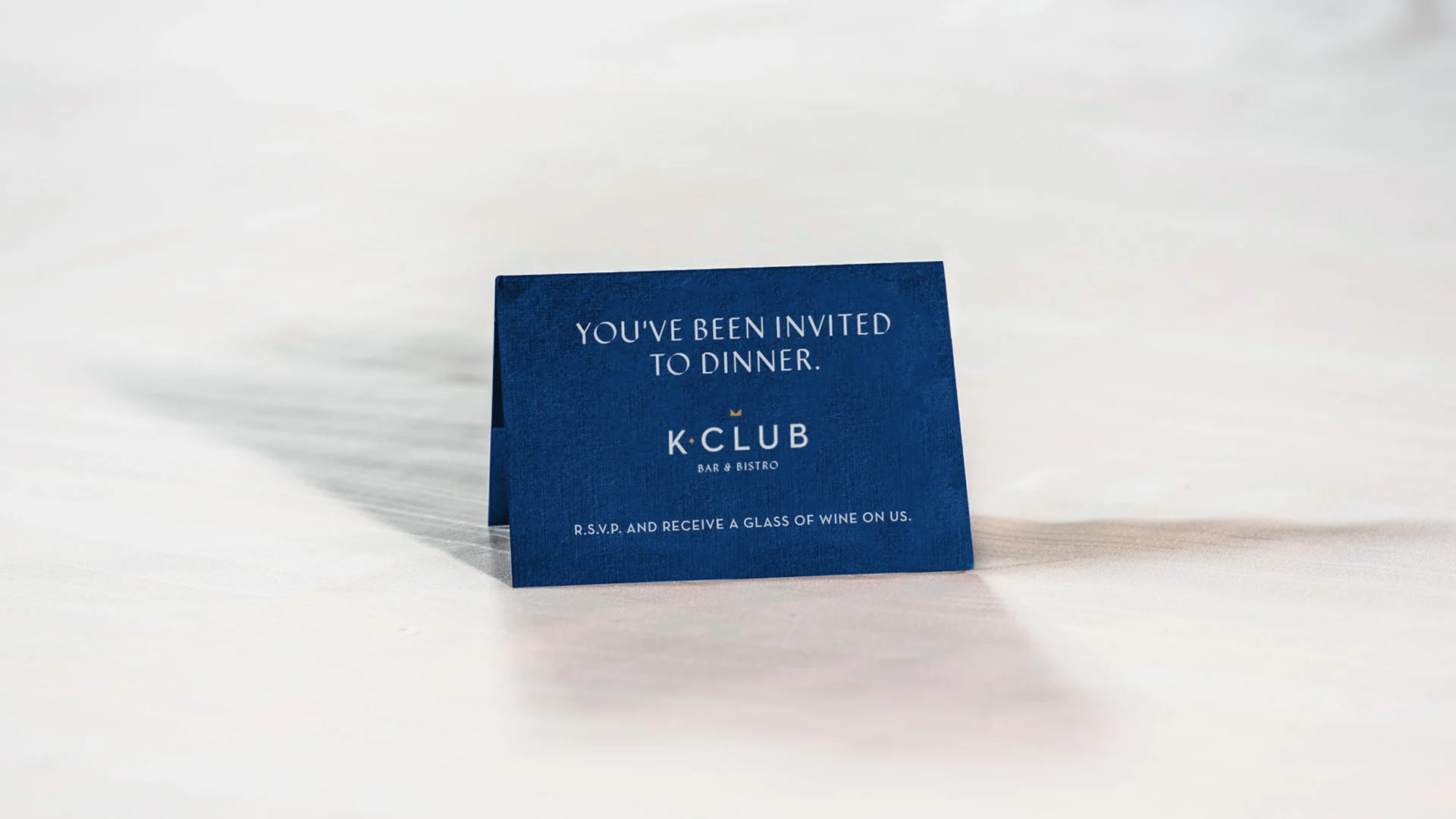
K Club Bar & Bistro is the hotel’s signature dining experience, complete with a three-course meal service. This logo is inspired by the subtle “K” pattern used throughout the hotel’s brand identity, but is turned on its side to reflect a crown as a nod to Karol’s beauty pageant days.


Tote.jpg
 

Agency: SPARK
Creative Director: Paul Wagner
Copywriter: Emily Seitz
Designer: Dana Householder